


UI/UX
Helping UCLA students discover and attend events happening on a busy campus.
Background
Mappening was originally a project done through UCLA DevX, a student club focused on joining student designers and developers into teams to create products that will improve the college experience of UCLA students.
Role
I joined the team and took over the role of designer fall quarter of 2018. The team had already built a map-based browsing view, was starting work on a calendar view, and needed designs for a weekly calendar view, user accounts feature, and other small missing features.
I delivered these new features, and worked with the team on implementing them. After the quarter long commitment ended, I started to explore a v2 of the app on my own to try to simplify the overall design.
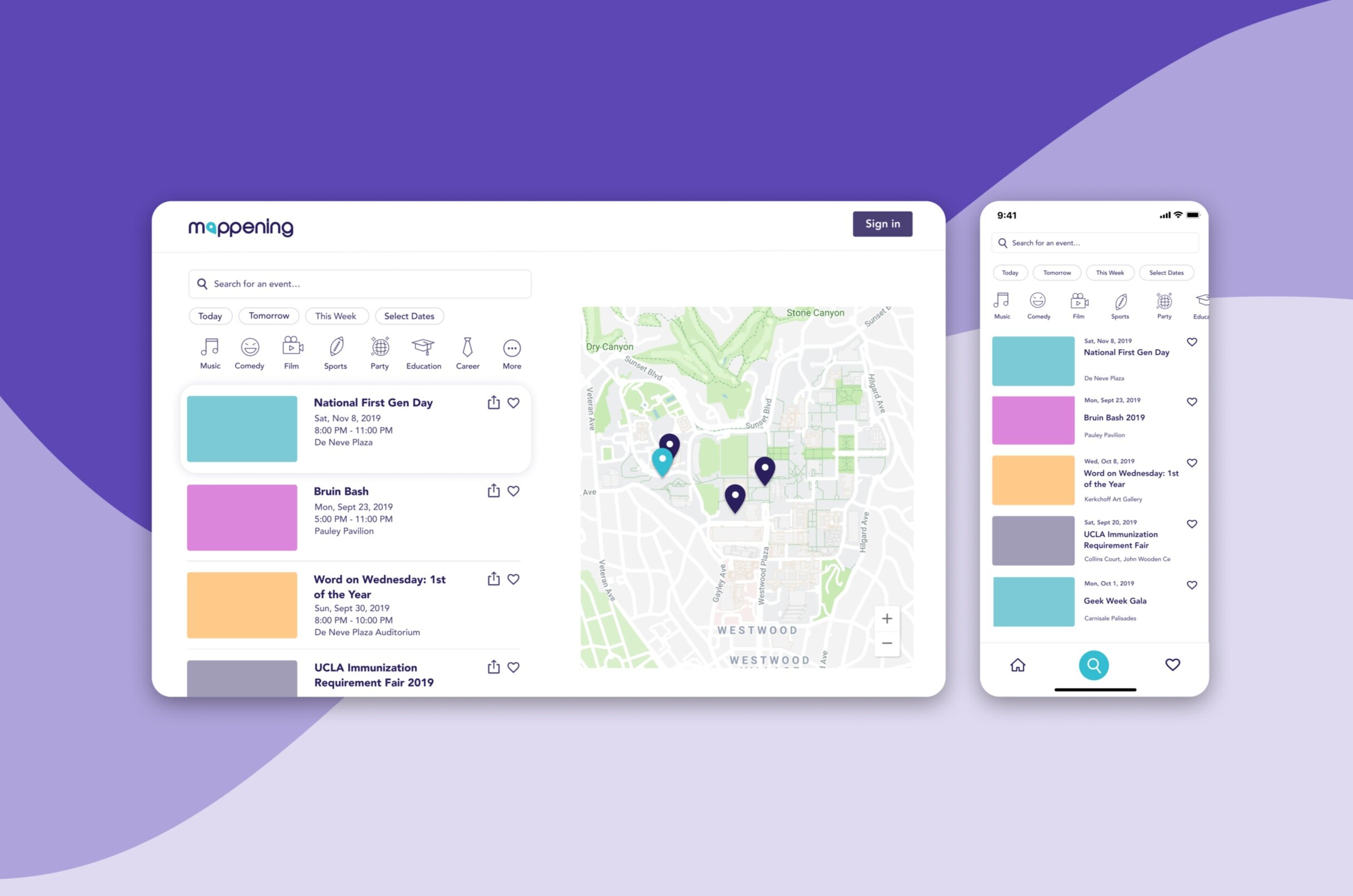
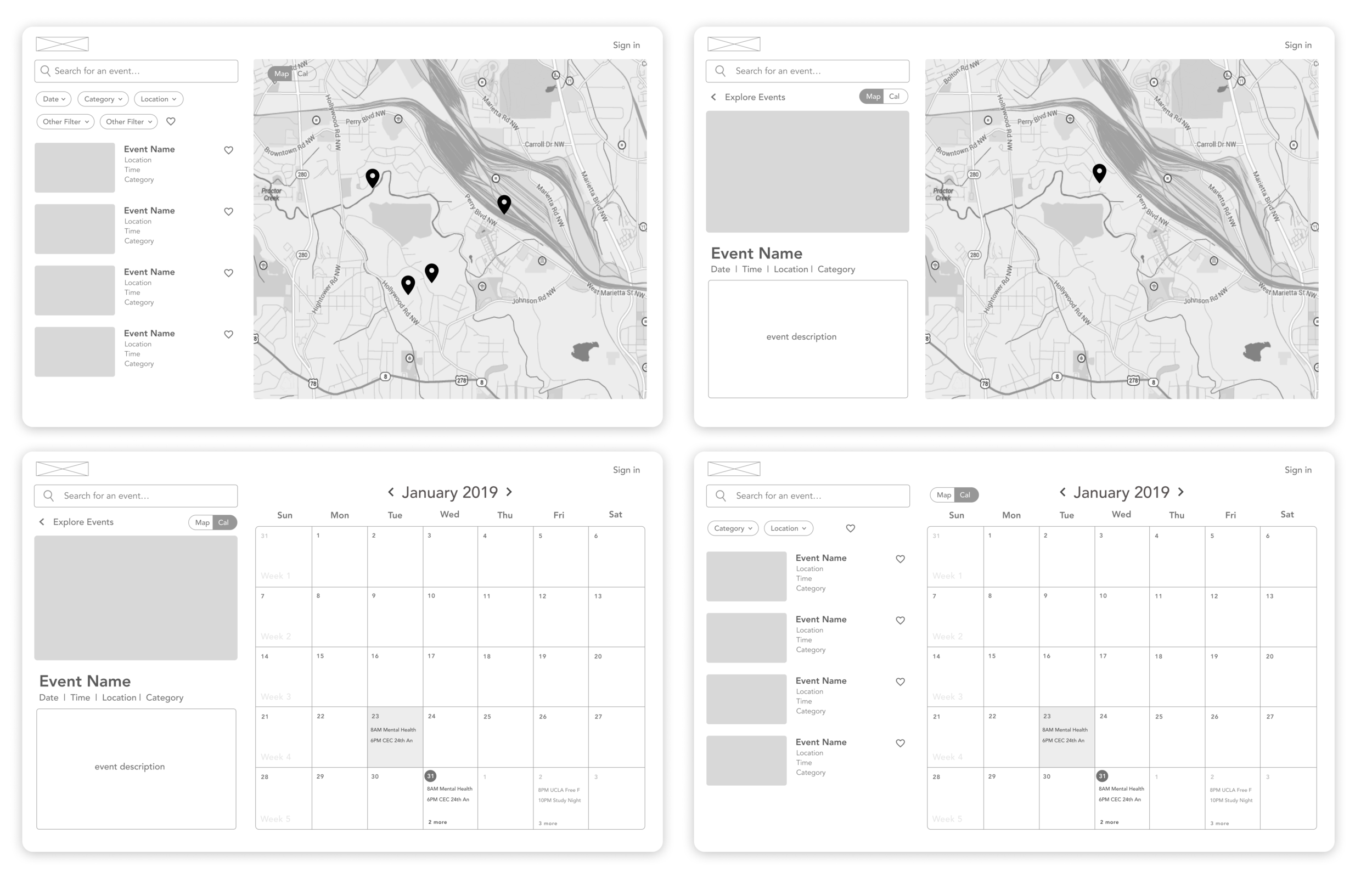
Students are able to search for events by name, as well as filter by date and category.
The default list shows the most popular events in the upcoming weeks.
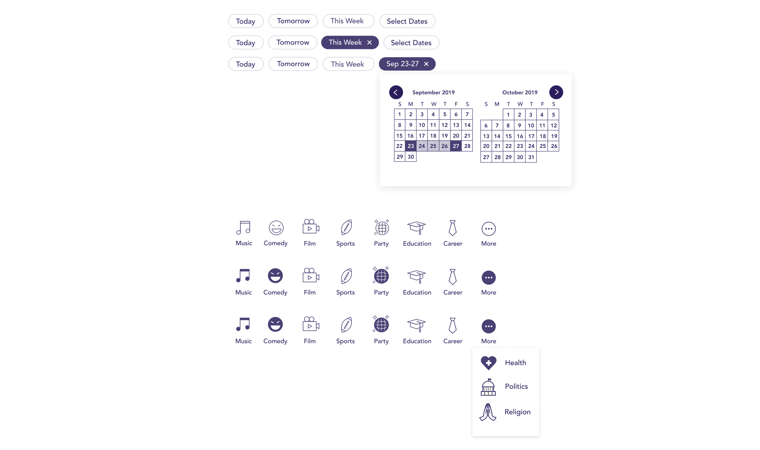
Filters
Students are able to filter by common date ranges or select a custom date range.
Events can also be filtered by choosing one or more categories. New categories can be easily added in the more menu.
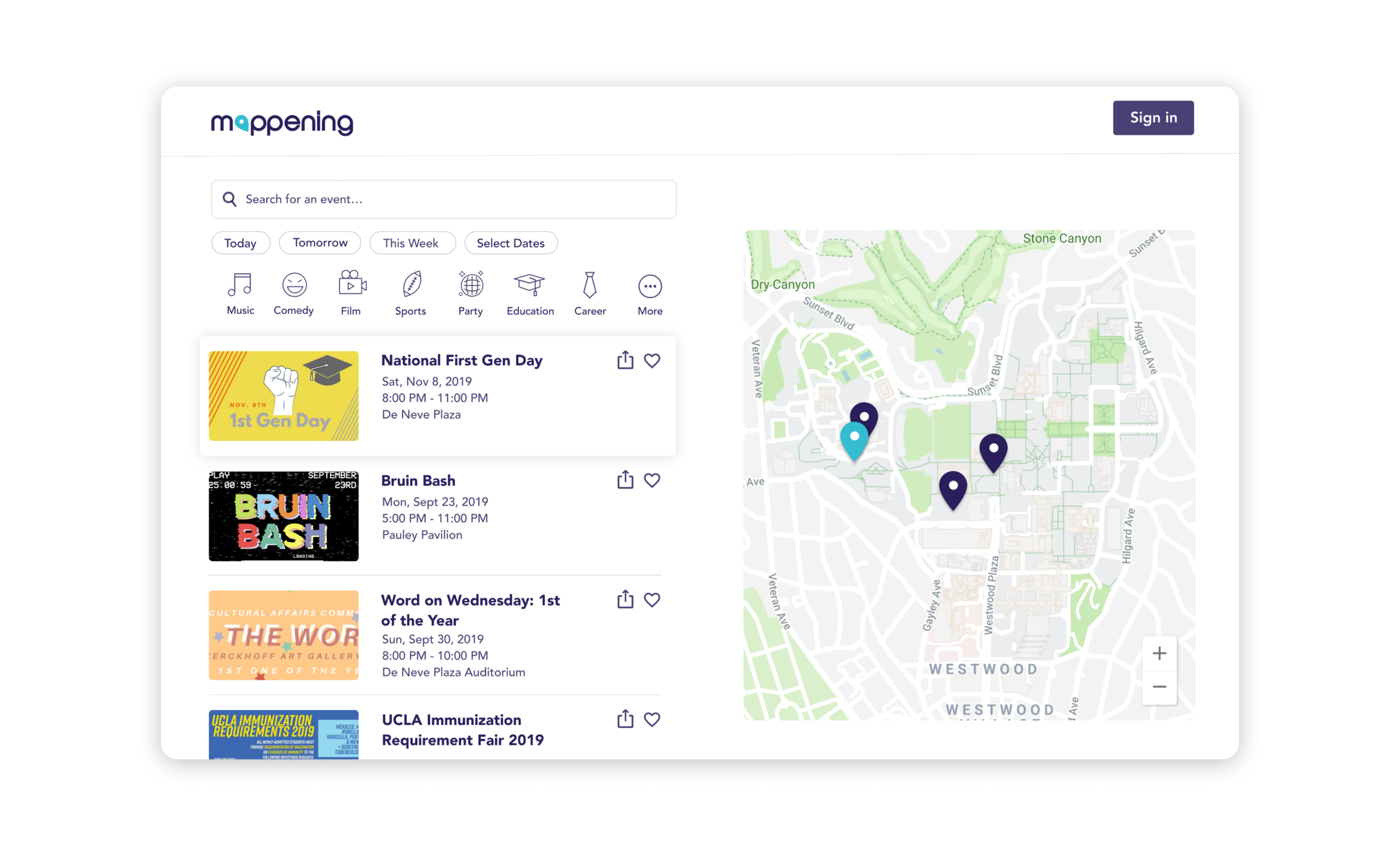
Event Page
After clicking on an event from the list, students are redirected to the event page.
The event page shows all of the information from the previews (cover photo, event name, time/date/location) as well as details from the organizer, location, and categories that the event falls under.
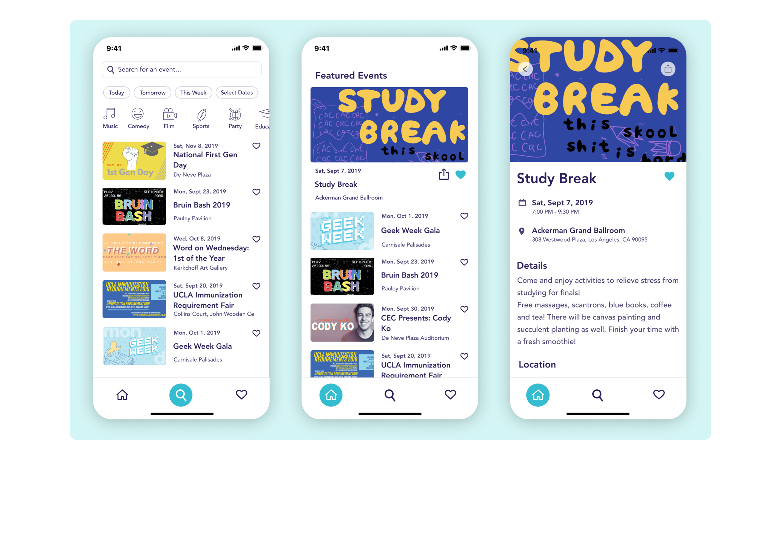
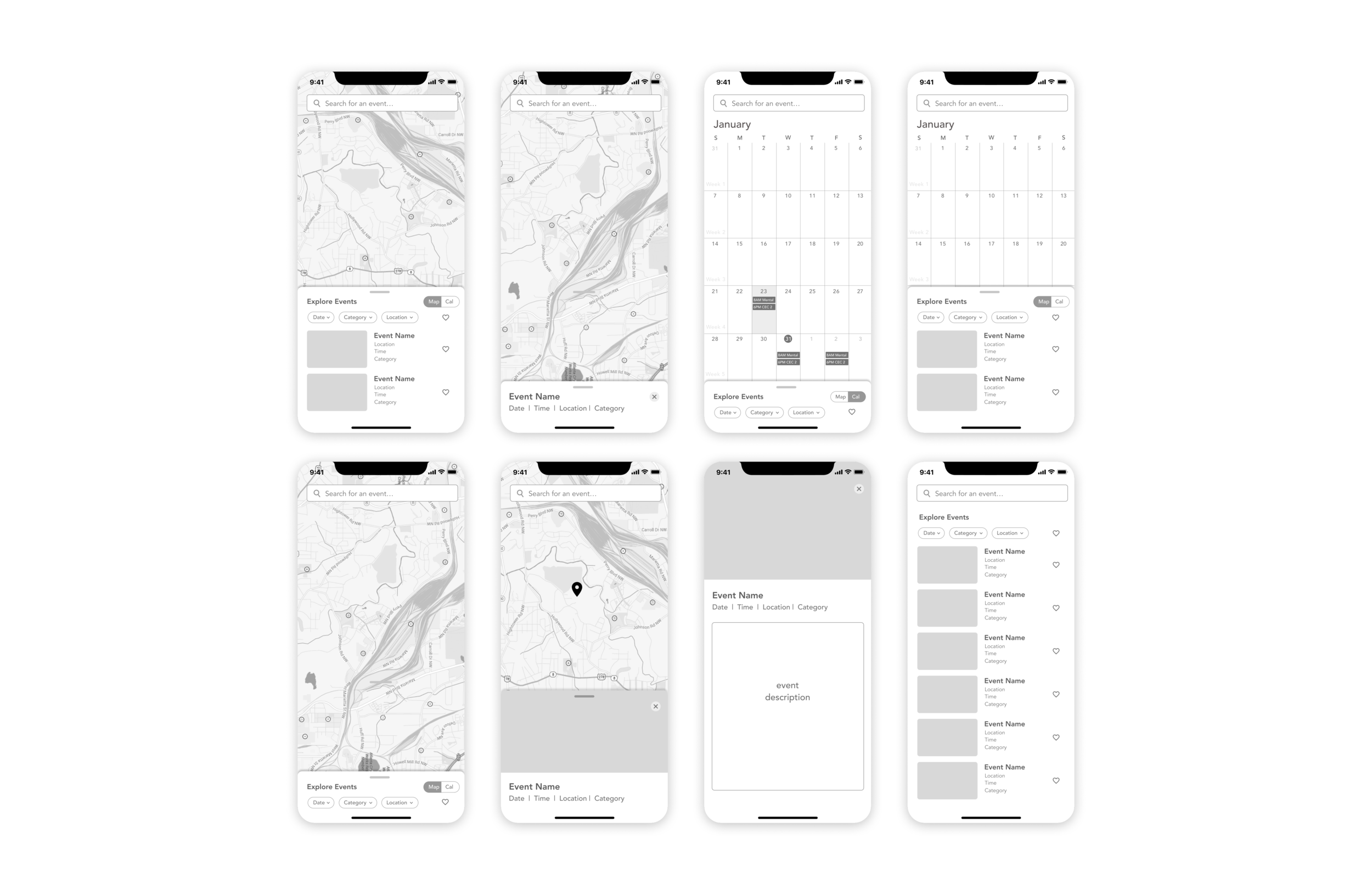
Mobile Design
The design for the mobile app is quite similar to the desktop with the same filters for browsing. It includes a home, search, and favorites tab in the navigation.
The events listed on the search tab are based off of popularity like they are on the website. The events listed on the home tab are recommendations based off what the user has viewed and favorited.
Problem
UCLA, like many college campuses is filled with busy students juggling classes, extracurricular, and social activities. As a result, a lot gets lost in the commotion. Mappening was created in order to provide a solution for students that want to discover more events happening on campus and expand their interests.
Users and Audience
As a UCLA DevX project, Mappening is designed to target undergraduate students attending UCLA, especially freshmen and transfers, as they are new to the school and least familiar with organizations and events on campus.
I joined the team when they were close to finishing the first version. My initial responsibilities were to streamline the calendar view and add a weekly calendar view. I also created icons and worked on small features in the existing design framework.
Because Mappening had switched leadership as well as the majority of their members, including designers between quarters, there were a lot of inconsistencies in the product presented at Demo Day.
Iteration 1
I decided to make a visual redesign to unify the overall UI of the app.
User feedback collected at Demo Day reported that students thought that the app was not intuitive enough and took too much time to figure out how to use. They also wanted to be able to export events to their personal calendars.
From the feedback, I added a share button that would allow users to export events to their personal calendars and I removed the weekly calendar view. It added more complexity without additional user value since there was already an existing monthly view.
Iteration 2
While making the wireframes for iteration 1, I realized that there were often too many events happening at the same time for the calendar to show and resulted in the feature not being very useful for browsing events.
While evaluating the more focused feature set, I decided to prioritize the filters instead of the map for browsing. Since the UCLA campus is quite small, most event locations are less than a 15 minute walk from each other. Because of that, the location of an event was not an important factor in deciding what events to attend. It would be more important to make sure that date and category filters were easy to use with as few clicks from the user as possible.
Iteration 2 to Final Version
From Iteration 2 to the final version, there were no big changes. I focused on deciding fonts, color scheme, and designing the logo to make the overall app feel like a real product.
The most important lesson I learned was that more features do not necessarily always make a product better.
My team had not created a solid enough foundation before attempting to add more complicated features, and as a result, they actually made the product less intuitive and harder to use.
Next steps
I would like to prototype this redesign and get more user feedback. I believe that adding some new features would benefit the app as long as they are done well with a good foundation. If I were to add more features in the future, I would make sure to keep the purpose of the product and intended users in mind while in the process of making new and exciting changes.